
On the occasion of the Center-funded Framing Fraktur at the Free Library of Philadelphia, we invited Brooke Davis Anderson, an expert on self-taught and outsider artists, to reflect on how embellished text is often found in their works. “Language—even taking the form of a visual index—has consistently allowed self-taught artists to express and expound on their emotional well-being and spiritual hopes, their fantasy worlds or their frustrating realities,” Anderson writes in the essay that follows.
Framing Fraktur features work by a variety of contemporary artists whose art uses a powerful combination of text and image, including Marian Bantjes (Canada), Bob and Roberta Smith (England), and Gert and Uwe Tobias (Romania/Germany).
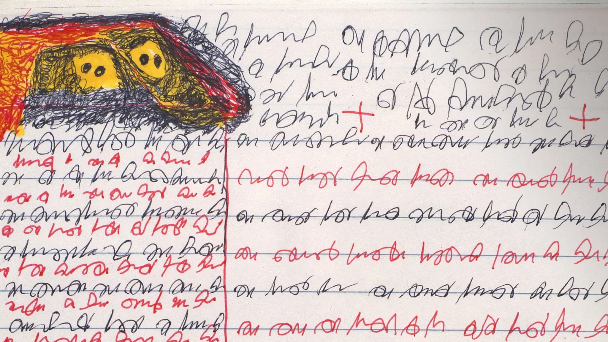
Swiss artist Adolf Wölfli (1864–1930) created an astounding body of work in the early 20th century that brings to mind fraktur, the 18th-century Pennsylvania German tradition. Like fraktur, it includes “certificate-like” compositions that incorporate text. Unlike fraktur, the text does not dominate; it is subordinate to emblematic icons and decorative symbols that are used in repetition, including birds, masked men, musical notes, cruciform shapes, stars, slug-like creatures, and strings of beads. Wölfli, of course, had no intention of making fraktur—it is likely that he had no knowledge of the Pennsylvania German tradition—but the similarities have been noted by curators and collectors in the past, and they are worth thinking about today.
The inclusion of text in compositions is common in works by self-taught artists, even if each incorporates language for different reasons. For some the motivations may be spiritual—I am thinking particularly of the work of John “J.B.” Murry (aka Murray), Sister Gertrude Morgan, Minnie Evans, Howard Finster, and William Blayney, to name but a few. For others, they may be medicinal or fantastical. Wölfli’s motivation seems to be the latter. He wrote lengthy manuscripts, often in the form of travelogues, recounting imaginary stories of fictitious planets, unreal places, made-up nations, and otherworldly landscapes. Being that this was a lifelong project, it is clear that storytelling delivered much pleasurable escape for him. But for the rest of us, his cursive is often illegible and nonsensical, reading like freeform poetry or stream-of-consciousness writing.
Wölfli did, on occasion, include Germanic text from a bygone era in his work. I note this here because the term fraktur also refers to a decorative, or “broken,” typeface that was commonly used in Germany from the 16th through the 19th centuries. Stylized language, unadorned by images, is sometimes seen in fraktur of the Pennsylvania German variety, but it is also seen in the work of self-taught artists, who have never been taught the “rules” of modern or contemporary art-making and are thus unaware of its scriptophobia.
Take, for example, John “J.B.” Murry (1908–88), who made text the sole visual element of his art. A sharecropper and a preacher from Georgia who experienced visions, he “wrote in the spirit.” The fervor of his technique and the abstract passages that only he could translate are like painted versions of speaking in tongues. Murry would hold a water-filled glass bottle up to his artwork to interpret the meanings of his private alphabet, which is composed of squiggles, splashes, and dashes, and then conduct a sermon-like reading. As he became more comfortable with his mark-making and material, he modestly increased his scale—from cash register tape to sheets of stationary to larger drawing paper—and expanded his medium from pen ink to paint, from his finger to a brush.
The mysterious language Murry created echoes similar intentions in the work of Charles Benefiel (b. 1967), who has developed codes and symbols to express a modern-day frustration. These resulted in prayers of a non-denominational sort. Benefiel was troubled by the growing prevalence of numbers standing in for personal identity in modern society—on passports, Social Security cards, driver’s licenses, utility bills, and credit card accounts—so he designed his own language based on randomly repeated symbols to combat and challenge it. In his visual lexicon, dots, circles, and dashes—each accorded its own sound—replace numerals. Graphically, zero is represented by a solid circle, and is communicated verbally by the sound “na.” The number one is a dot; its sound is “ba.” Four is a circle and sounds like “da”. While drawing, the artist recites the corresponding sounds of his invented “dumb language,” thus making the process a mathematical, visual, and musical experience all at once. Though this three-tiered process is complex, the resulting drawings appear overtly simple and minimalistic.
Drawing, painting, collaging, and sculpting have proved to be valid and satisfactory forms of communication. Language—even taking the form of a visual index—has consistently allowed self-taught artists to express and expound on their emotional well-being and spiritual hopes, their fantasy worlds or their frustrating realities. And even if the meanings are masked both by unconventional graphic forms and the individual circumstances of their creators—distinguishing them significantly from fraktur, which were created specifically to be read by others, to recite and record family events, communal moments, and life rituals—the analogue between two worlds may be closer than we think.